Interface Overview
This guide walks you through every screen of the Widget Builder application. Each section includes a screenshot and a plain-language description of what you see and what you can do. No technical knowledge is required — this overview is designed for project managers, communicators, and anyone getting started with the Widget Builder.
Sign In
When you open the Widget Builder, the first screen you see is the Sign In page.
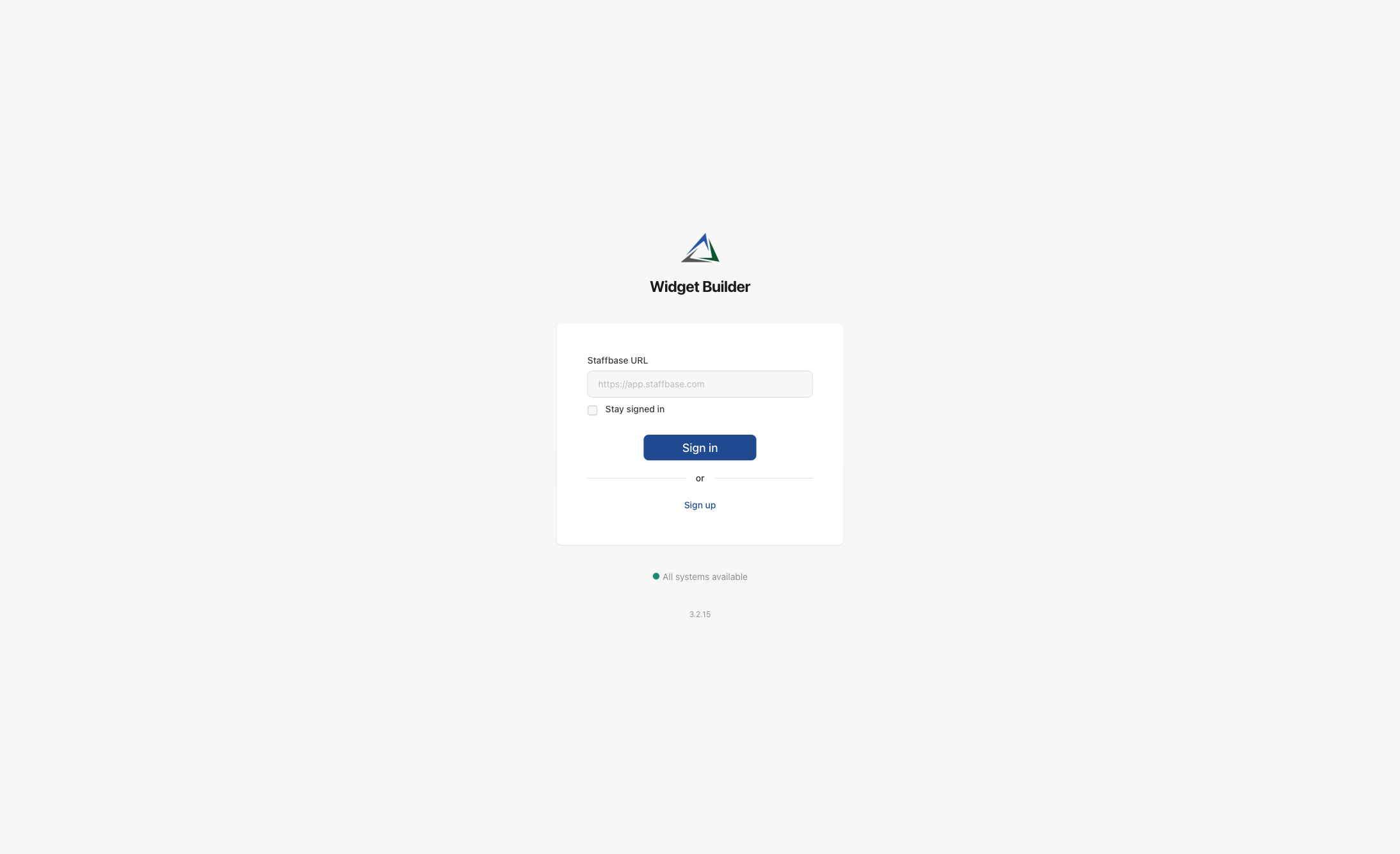
What you see on this screen:
- Widget Builder logo and title — confirms you are on the correct application.
- Staffbase URL field — enter the web address of your Staffbase platform (e.g.
https://yourcompany.staffbase.com). This connects the Widget Builder to your organization. - Stay signed in — check this box if you want to remain logged in between sessions.
- Sign in button — starts the login process. You will be redirected to Staffbase to confirm your identity.
- Sign up — if your organization has not yet registered for the Widget Builder, use this link to start the registration process.
- System status — at the bottom of the page, a green indicator shows whether all Widget Builder services are running normally.
- Version number — the current version of the application is displayed at the very bottom.
You must be an administrator in your Staffbase platform to sign in. Regular employees cannot access the Widget Builder.
Registration
If your organization is new to the Widget Builder, you will go through a two-step registration process.
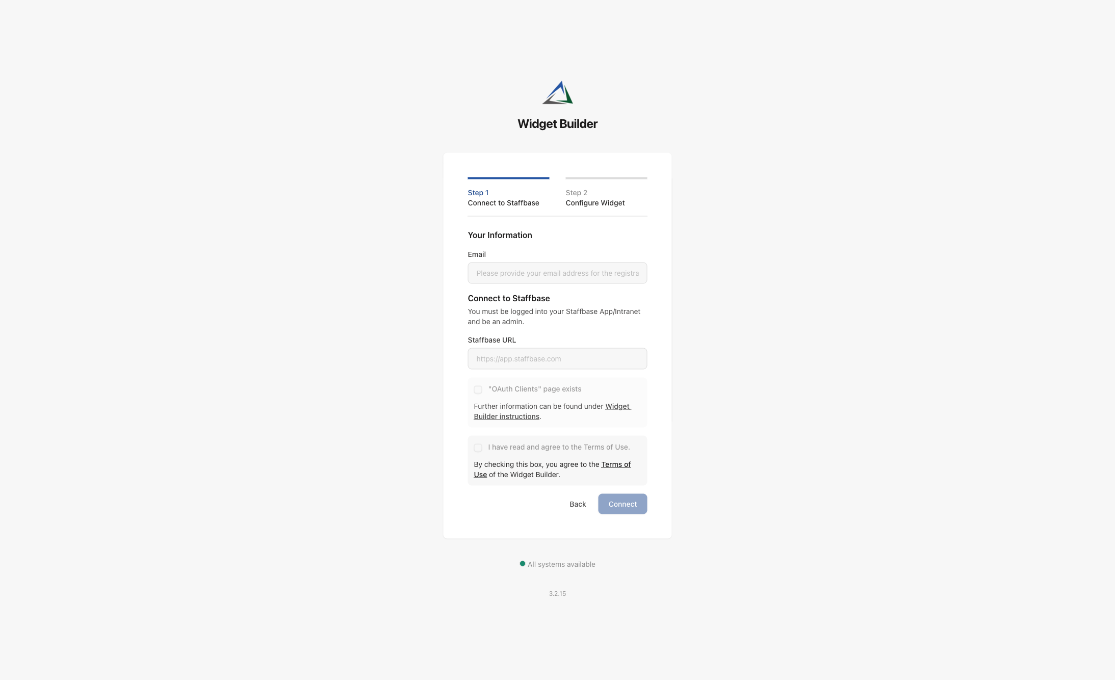
What you see on this screen:
- Progress bar — shows that registration has two steps: Connect to Staffbase and Configure Widget.
- Your Information — enter the email address that should be associated with this Widget Builder account.
- Staffbase URL — enter your Staffbase platform address, just like on the sign-in screen.
- "OAuth Clients" page exists — a checkbox to confirm that your Staffbase platform supports OAuth connections. This is required for the Widget Builder to communicate with Staffbase.
- Terms of Use — you must read and accept the Terms of Use before proceeding.
- Back / Connect buttons — go back to the sign-in page or proceed with the connection.
The registration only needs to be done once per organization. After the initial setup, all administrators can sign in directly.
Dashboard
After signing in, you land on the Dashboard — the home screen of the Widget Builder.
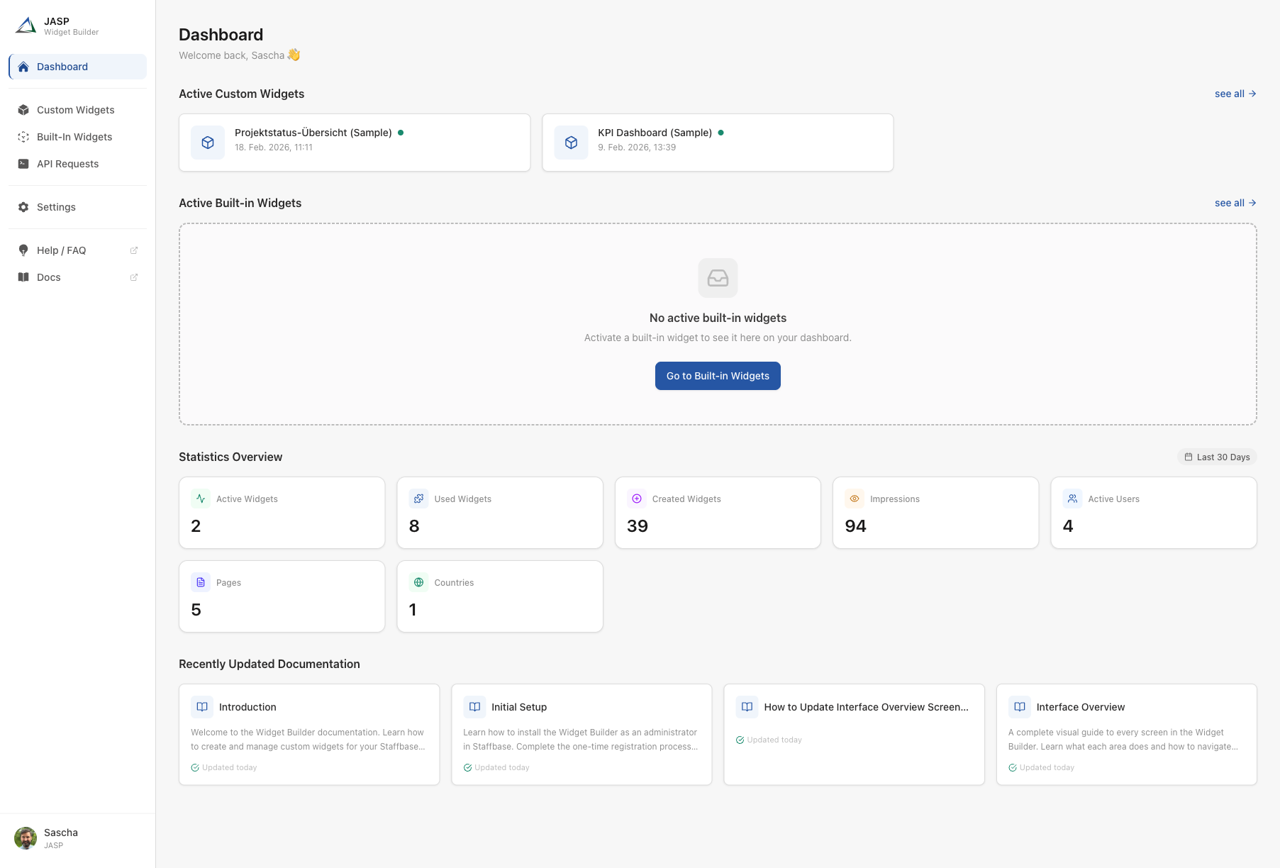
What you see on this screen:
The dashboard is divided into two main areas: the sidebar navigation on the left and the main content area on the right.
Sidebar Navigation
The sidebar is visible on every screen and provides access to all sections of the application:
| Menu Item | Description |
|---|---|
| Dashboard | The home screen with an overview of your widgets and activity |
| Custom Widgets | Your self-built widgets — create, edit, and manage them here |
| Built-In Widgets | Pre-made widget templates provided by JASP that you can activate |
| API Requests | Manage connections to external data sources (e.g. news feeds, weather services) |
| Settings | Account settings, permissions, and API tokens |
| Help / FAQ | Opens the frequently asked questions page (external link) |
| Docs | Opens this documentation site (external link) |
Main Content
The dashboard shows a quick summary of your current setup:
- Active Custom Widgets — a row of cards showing your active custom widgets. Each card displays the widget name, its status (active/inactive), and when it was last updated. Click "see all" to open the full widget list.
- Active Built-in Widgets — same format as above, but for pre-made widgets. If none are activated yet, a prompt invites you to explore the built-in widget library.
- Statistics Overview — key numbers at a glance: how many active widgets you have, total impressions, active users, pages, and countries. These statistics cover the last 30 days.
- Recently Updated Documentation — links to the latest documentation articles, so you can stay up to date with new features and guides.
Custom Widgets List
Click Custom Widgets in the sidebar to see all your widgets in one place.
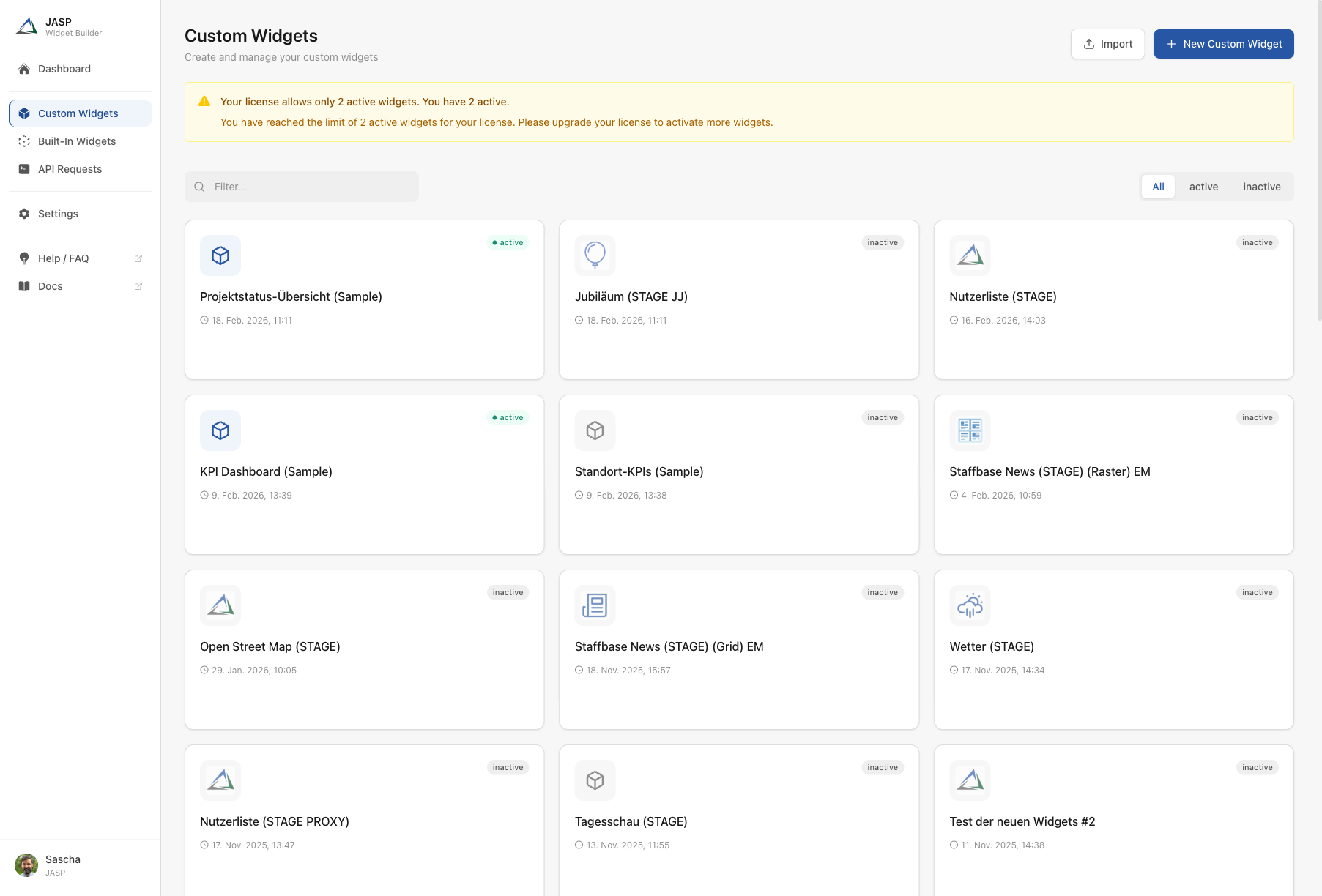
What you see on this screen:
- Page title and description — "Custom Widgets" with a subtitle explaining the purpose of this page.
- Import button — import widgets that were exported from another Widget Builder account.
- New Custom Widget button — create a brand-new widget from scratch.
- Filter bar — a search field to quickly find a widget by name. Next to it, filter buttons let you show All, only active, or only inactive widgets.
- Widget cards — each widget is displayed as a card with:
- A widget icon (customizable per widget)
- The widget name
- A status badge — green "active" means the widget is live in Staffbase; gray "inactive" means it is not currently available to users
- The last updated date
- Action buttons for Edit, Export, and Delete (visible on hover)
Use the filter buttons to quickly see which widgets are currently live ("active") and which are still in draft ("inactive").
Widget Editor
When you create or edit a widget, the Widget Editor opens. This is where you configure everything about your widget. The editor has a sidebar with five numbered sections and a large content area.
Editor Header and Sidebar
Every editor screen shares the same layout:
- Back button (top left) — return to the widget list without saving.
- Widget icon and name — shown in the header. Below it: "Last saved" timestamp.
- Close and Save buttons (top right) — close discards changes; save stores your work.
- Sidebar sections — five numbered tabs on the left, each handling a different aspect of the widget. Click "Open" to switch between them.
- Guide bar (bottom) — a step-by-step assistant that walks you through each section. It shows which step you are on, offers a "Learn more" link, and a "Next" button to proceed.
- Status bar (very bottom) — shows the connection status and a reminder that changes are not saved automatically.
1. General
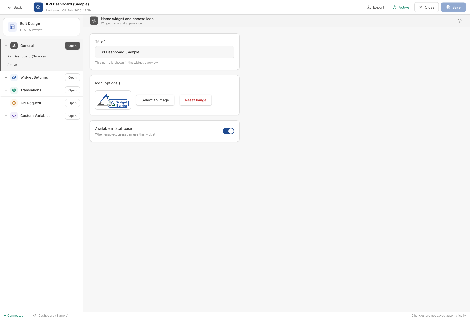
The General section is the starting point when creating a new widget.
- Title (required) — the name of your widget. This name appears in the widget list and when users browse available widgets in Staffbase.
- Icon (optional) — upload a custom image to make your widget easily recognizable. You can also reset it to the default icon.
- Available in Staffbase — a toggle switch. When turned on, users in your Staffbase platform can find and use this widget. When turned off, the widget is in draft mode and not visible to anyone.
2. Widget Settings
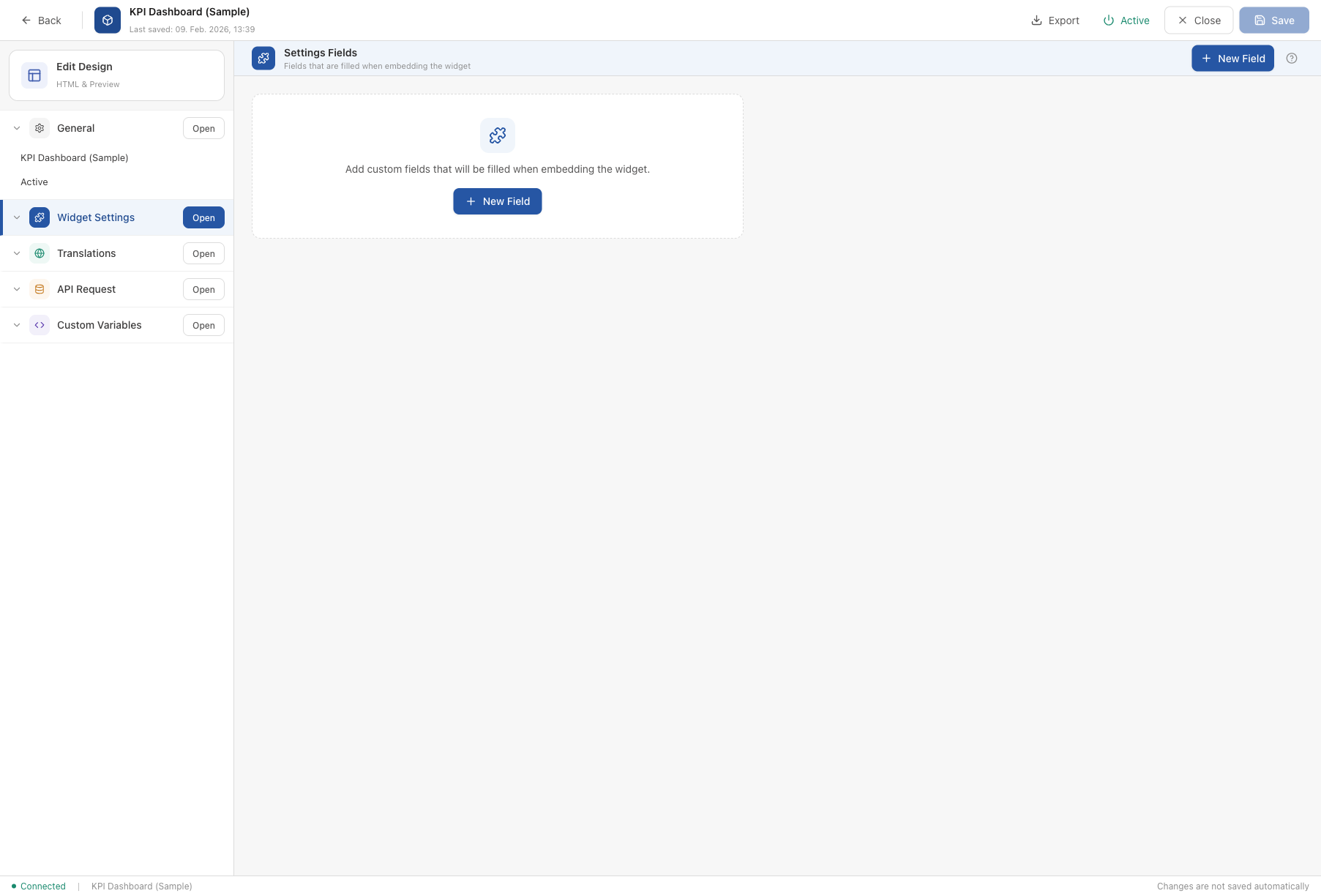
The Widget Settings section lets you define configurable fields that appear when someone adds the widget to a Staffbase page.
- Settings Fields — a list of custom fields (e.g. text inputs, dropdowns, toggles). These fields are filled in by the person who places the widget on a page, not by the end user.
- New Field button — add a new configurable field. You can choose from various field types like text, number, dropdown, image upload, and more.
Example: A "Company News" widget might have a settings field called "Maximum number of articles" so the page editor can control how many news items are displayed.
3. Translations
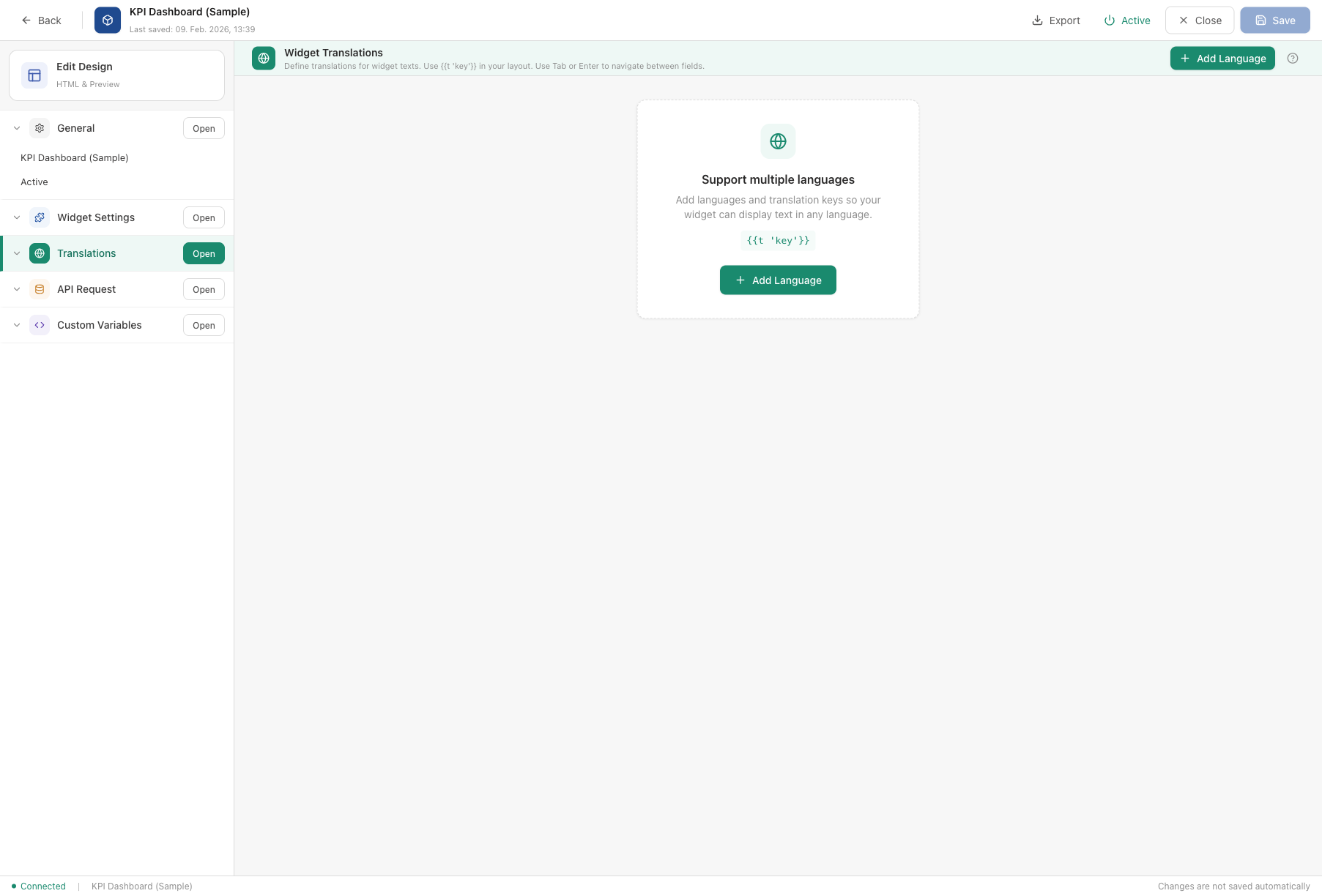
The Translations section allows your widget to display text in multiple languages.
- Add Language button — add support for a new language (e.g. English, German, French).
- For each language, you define translation keys and their values. A translation key is a short identifier (like
titleorreadMore) that you reference in your widget layout. - In your widget layout, use
{{t 'key'}}to insert translated text. The Widget Builder automatically picks the correct language based on the user's Staffbase settings.
Example: The key readMore could have the value "Read more" in English and "Weiterlesen" in German.
4. API Request (Data Source)
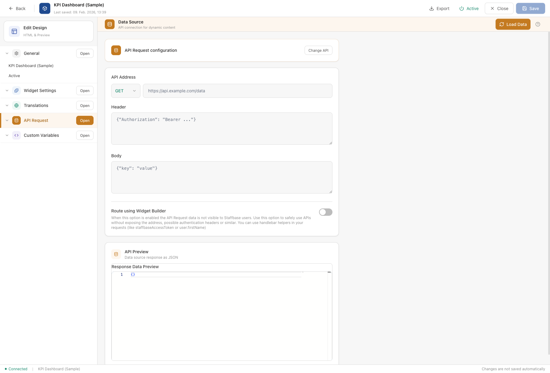
The API Request section connects your widget to an external data source.
- Select API — choose from your configured API connections (managed on the API Requests page). The selected API's HTTP method (e.g. GET) is shown as a badge.
- Load Data button — fetch a sample response from the API to preview the data your widget will receive.
- API Preview — displays the raw response from the API in JSON format. This helps you understand the data structure so you can reference the correct fields in your widget layout.
Example: A weather widget connects to a weather API. The response contains fields like temperature, city, and condition, which you can then display in the widget layout using {{data.temperature}}.
5. Custom Variables
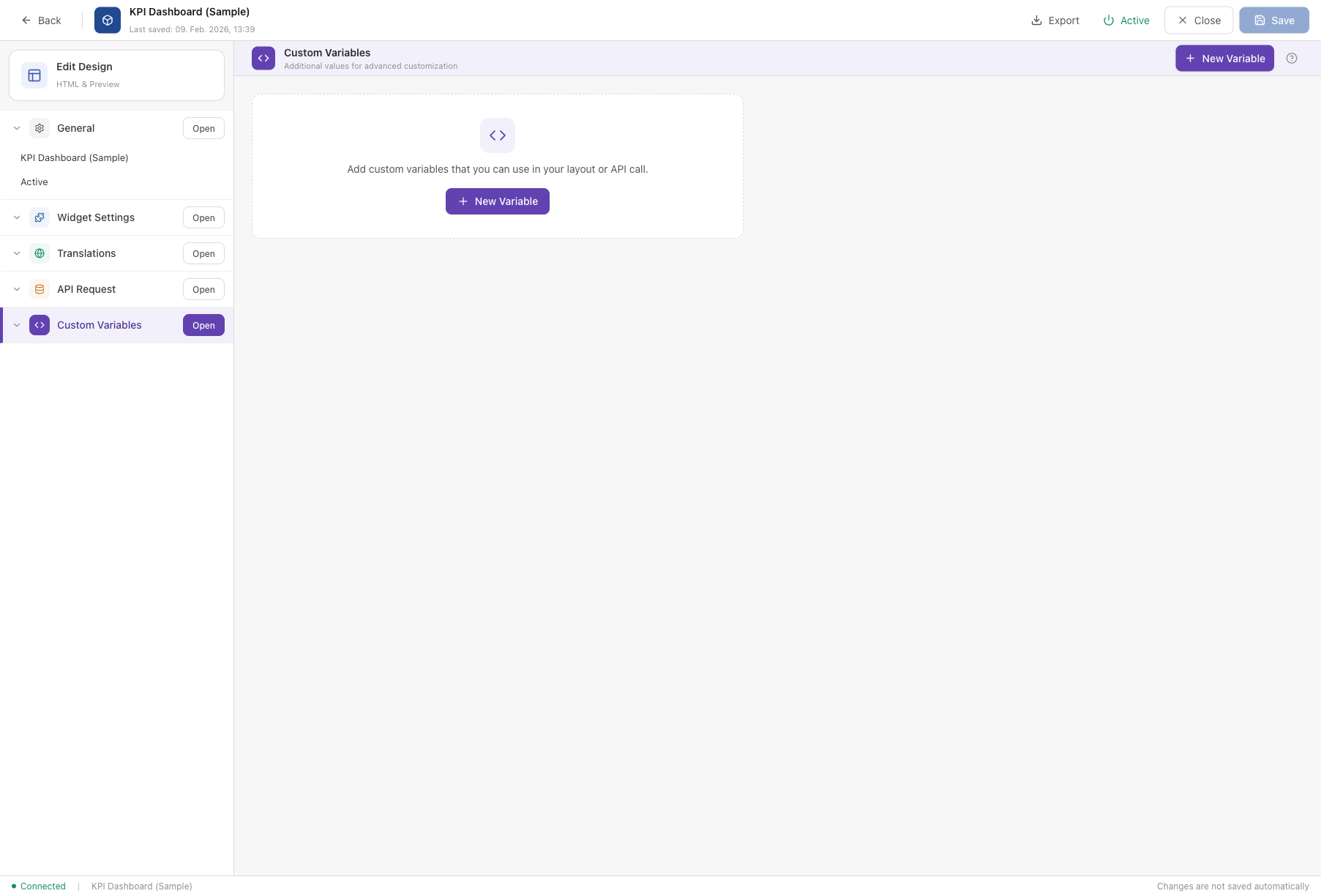
The Custom Variables section lets you define reusable values that can be used in your widget layout or API calls.
- New Variable button — add a key-value pair. The key is a name you choose; the value can be any text or number.
- Variables are referenced in the layout using
{{variables.yourKey}}.
Example: A variable refreshInterval with value 300 could control how often a widget updates. Or a primaryColor variable lets you change the widget's color scheme from one central place.
6. Edit Design (Layout Editor)
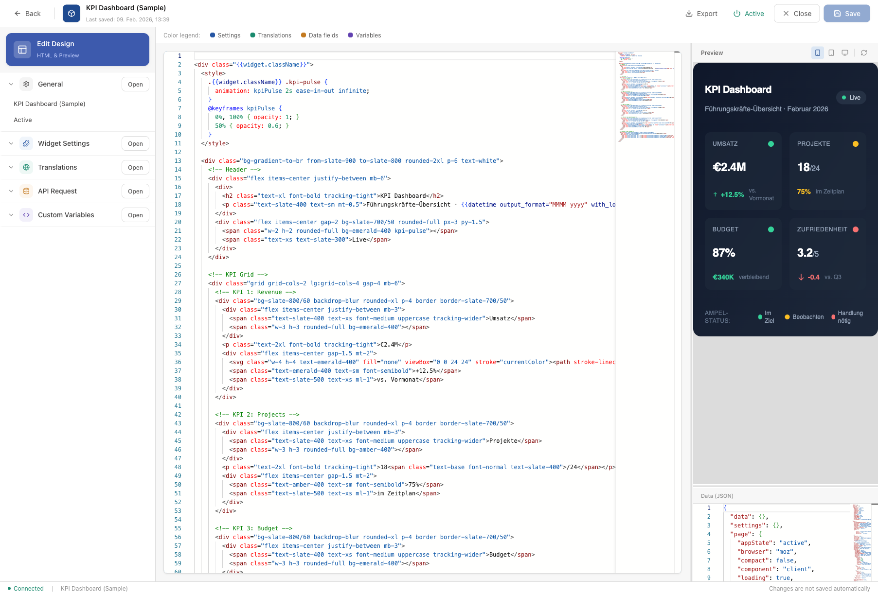
The Edit Design section is the visual heart of the Widget Builder. This is where you write the HTML layout that determines how your widget looks.
The screen is split into three areas:
- Code Editor (left) — write your widget's HTML using Handlebars templating syntax. A color legend at the top helps you distinguish between different types of dynamic content:
- Blue = Settings fields (values from the Widget Settings tab)
- Green = Translations (text from the Translations tab)
- Orange = Data fields (values from the API response)
- Purple = Custom variables
- Preview (top right) — a live preview of your widget as it will appear in Staffbase. Use the device buttons (mobile, tablet, desktop) to see how the widget looks at different screen sizes. Click "Refresh" to update the preview.
- Data (JSON) (bottom right) — the test data used for the preview. You can edit this JSON to simulate different API responses and see how your widget handles them.
Click "Insert starter template" if you are starting from scratch. This gives you a working HTML skeleton that you can customize.
API Requests
Click API Requests in the sidebar to manage your external data connections.
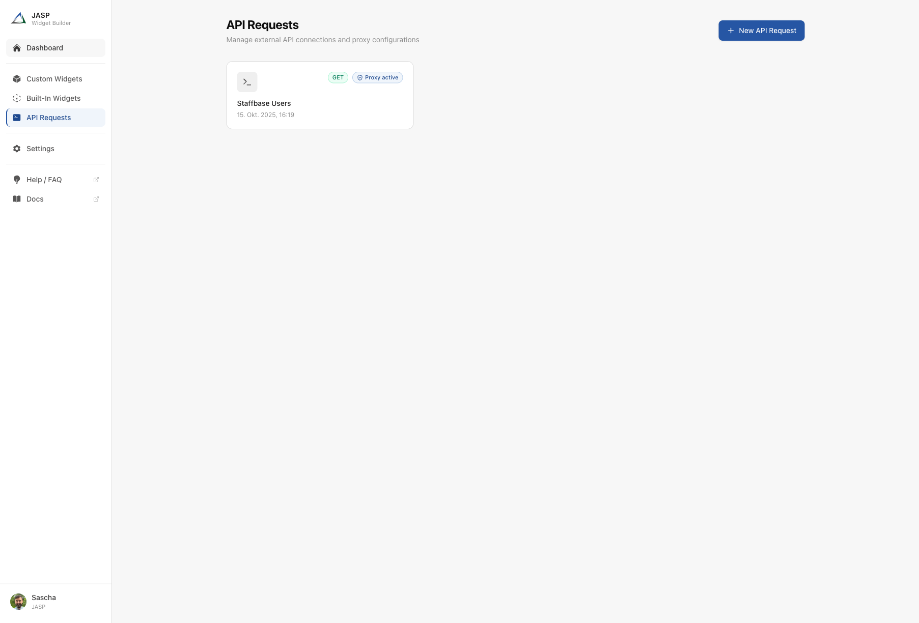
What you see on this screen:
- Page title and description — "API Requests" with the subtitle "Manage external API connections and proxy configurations".
- New API Request button — create a new connection to an external data source.
- API request cards — each configured API connection is shown as a card with:
- A terminal icon
- The HTTP method badge (e.g. "GET" in green) — indicates what type of request is made
- The API name you assigned
- The last updated date
- User profile (bottom left of the sidebar) — shows your name and organization. Click to access your profile settings.
API requests act as a bridge between your widgets and external services. Once configured here, any widget can use them via the API Request tab in the editor.
Settings
Click Settings in the sidebar to view and manage your account configuration.
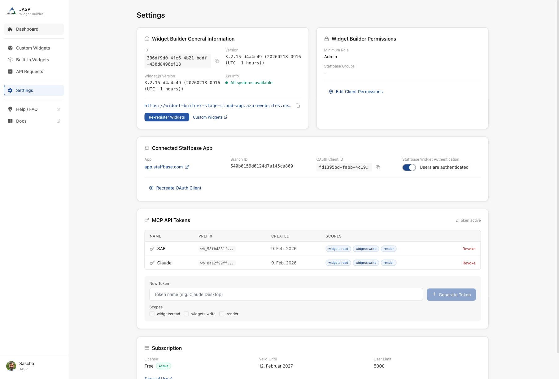
What you see on this screen:
The Settings page is divided into several sections:
Widget Builder General Information
- ID — your unique Widget Builder account identifier (useful for support requests).
- Version — the current version of the Widget Builder application and the Widget.js file.
- API Info — a status indicator showing whether all backend services are running normally.
- Widget Bundle URL — the URL that connects your widgets to Staffbase. This URL is registered automatically during setup. You can copy it or click "Re-register Widgets" if needed.
- Custom Widgets link — opens the widget settings in your Staffbase admin panel.
Widget Builder Permissions
- Minimum Role — the minimum Staffbase role required to access the Widget Builder (typically "Admin").
- Staffbase Groups — permission groups that control which users in your organization can use the Widget Builder. Each group links to its Staffbase admin page.
- Edit Client Permissions — change the role and group settings (requires Admin privileges).
Connected Staffbase App
- App — the Staffbase platform URL your Widget Builder is connected to.
- Branch ID — the technical identifier of your Staffbase environment.
- OAuth Client ID — the OAuth credentials used for the connection.
- Staffbase Widget Authentication — a toggle that controls whether widgets verify user identity. When enabled, widgets can display personalized content.
MCP API Tokens
- Token table — lists all active API tokens with their name, prefix, creation date, and assigned scopes (permissions).
- Revoke — deactivate a token if it is no longer needed.
- New Token — create a new token by entering a name, selecting scopes (e.g. widgets:read, widgets:write, render), and clicking "Generate Token".
MCP API tokens allow AI assistants like Claude or Cursor to create and manage widgets on your behalf. See the MCP Server documentation for setup instructions.
Subscription
- License — your current plan (e.g. "Professional") and its status ("Active").
- Terms of Use — a link to the Widget Builder terms and conditions.
Summary
The Widget Builder interface is organized around a clear structure:
| Area | Purpose |
|---|---|
| Sign In / Registration | Access the application and connect to your Staffbase platform |
| Dashboard | Overview of your widgets, statistics, and recent documentation |
| Custom Widgets | List, create, import, and manage your widgets |
| Widget Editor | Configure every aspect of a widget across six sections |
| API Requests | Set up connections to external data sources |
| Settings | Manage your account, permissions, and API tokens |
Every screen is designed to guide you step by step. The editor's built-in guide bar and "Learn more" links connect directly to detailed documentation articles whenever you need more information.